The Colours of Black & White – 1
Simply put, standard black & white printing produces an image the ‘colour’ of which depends on the paper used and the developer, discounting any toning afterwards. Every black has its own hue, this can be from any part of the spectrum. Warm toned papers and developers give a black that tends towards brown/yellow, cold toned paper and developers give a black that tends towards the blue.
These days, with the limited range of papers available to the traditional printer (without considering toning), there isn’t much choice when it comes to choosing one that has an inherent warm or cold tone. Developers can make a difference though and I decided to try one that intrigued me the first time I saw it in the ‘Darkroom Cookbook‘, third edition.
Gevaert G.261 is listed as a ‘Brown-Black Paper Developer’ – Formula #97 in that book. Its composition is given in my Formulae section. In addition to the usual components of a standard developer it is a Hydroquinone/Glycin mix. What interested me was the claim that the colour of the image could be altered depending on the dilution/development time – see formula notes.
Glycin (N-(4-hydroxyphenyl)glycine) is hard to get hold of in the UK, but many years ago I acquired a small quantity of it when I purchased a large box of mixed chemicals from someone giving up darkroom work. I only had 5 grams, the formula calls for 6 grams, but I decided to give it a try anyway. Another issue is that it has very poor keeping qualities, mine had turned into a light brown powder when it should be white, but it was worth a try so I made the mix.
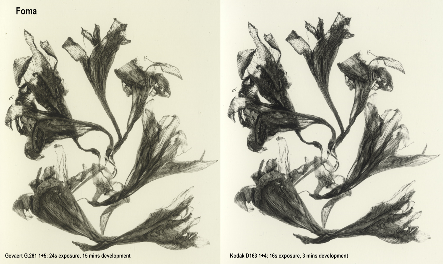
The three papers I had in mind to test were: (a) my standard ‘go-to’ Fomatone MG Classic 131 FB; (b) Ilford Multigrade FB Warmtone; and Adox Nuance FB Grade 2, now sadly discontinued.
Here are the results, side by side for each paper.

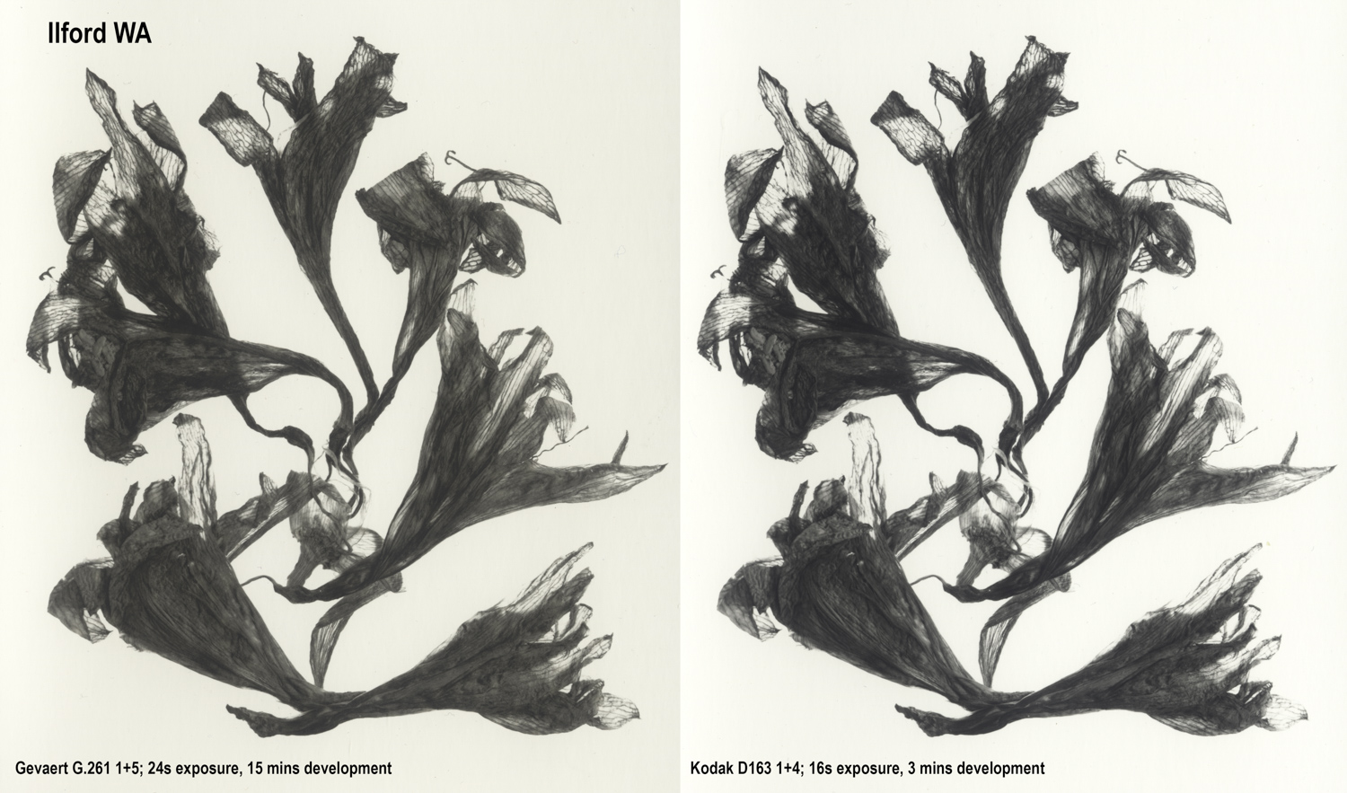
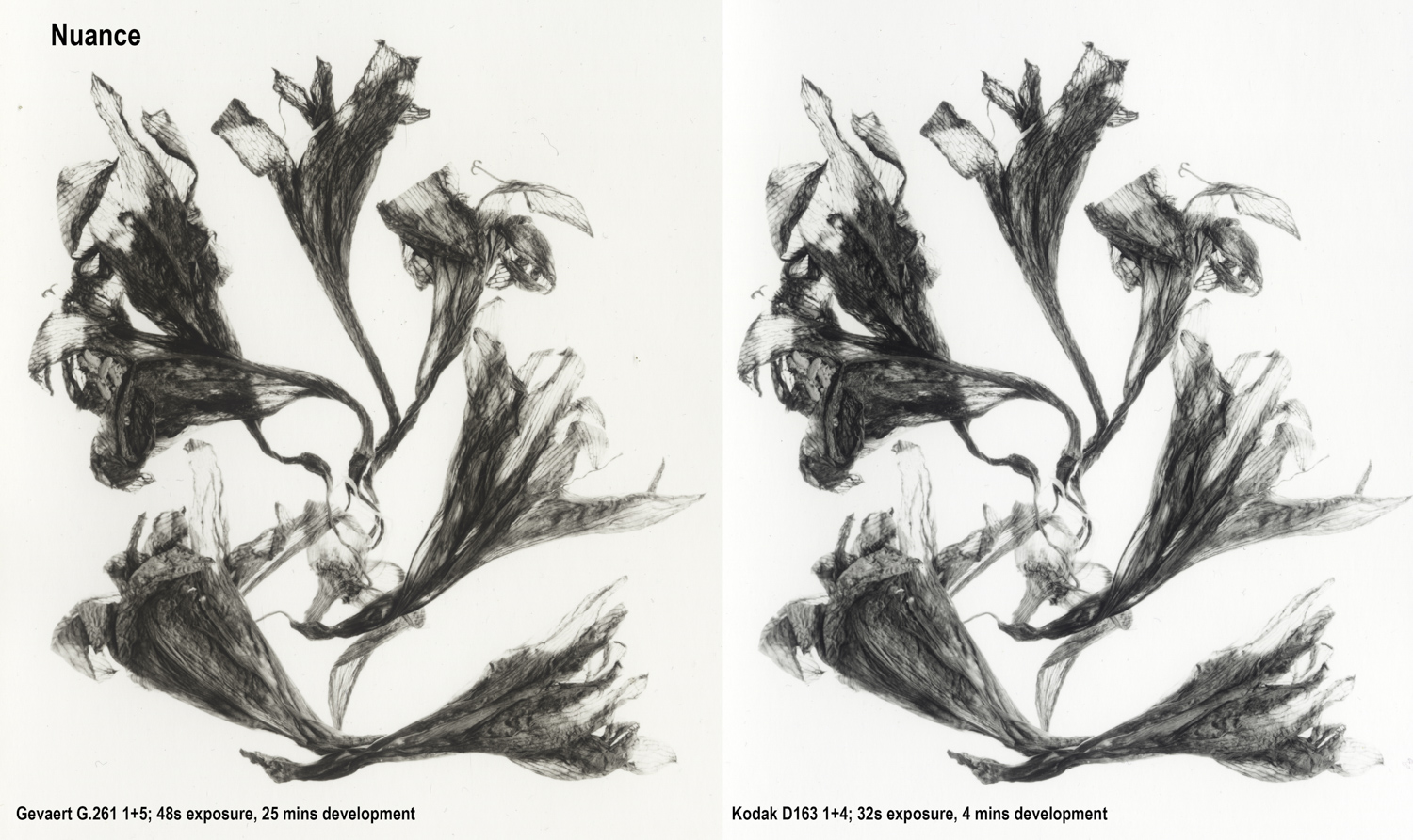
Observations:
- Given the limitations of scanning and reproducing on screen such subtle colour change, there is a noticeable shift to a warmer colour in each case but not the ‘red’ colouration noted in the formula details.
- Given that the glycin was old and had probably lost some efficacy – and that I was 1 gram short – I was pleased to see that some effect is apparent.
- The extended development time required for G.261 benefitted from a ½ stop increase in exposure over the D163 control print in each case.
- Grade 2 filtration was used for the Ilford and Foma variable contrast papers, the Nuance is a fixed grade 2.
- The Ilford prints are slightly overexposed. I gave the same exposure as the Foma without doing a new test strip. It would seem that the Ilford paper is slightly faster than the Foma.
- The Nuance was known to be 1 stop slower than the Foma so exposure times were doubled.
- Some staining/chemical fogging of the paper base is apparent on all the G.261 prints, most noticeably on the Foma and Ilford.
- The Foma is an inherently warm tone paper on an ‘ivory’ base. It is also prone to picking up more base colour during ‘alternative’ processing in my experience.
- All processing was at 20oC
Overall, it was a worthwhile attempt at exploring this developer, but the results fell far short of what was expected. I put this down the failure of the ancient glycin to do its job, plus the fact that modern papers probably aren’t as responsive as those of old.
What it did bring home to me was what a fine paper Adox Nuance was, giving by far the best standard print of this subject. I still have around 25 sheets left…
Comments
The Colours of Black & White – 1 — No Comments
HTML tags allowed in your comment: <a href="" title=""> <abbr title=""> <acronym title=""> <b> <blockquote cite=""> <cite> <code> <del datetime=""> <em> <i> <q cite=""> <s> <strike> <strong>