Slavich Bromportrait Lith – First print

Slavich Bromportrait in Moersch EasyLith.
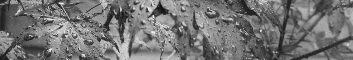
The original negative was on 120 Tri-X, from my Fuji GW690III, developed in PMK developer. The photograph was taken at dawn at Arbor Low stone circle, Derbyshire in April 2011. A digital color interpretation of the same scene may be seen on my Flickr pages.
This print was made on Slavich Bromportrait paper, double-weight glossy Grade 3, the only grade available in the UK at the moment. It was developed in Moersch EasyLith diluted 1+25 (A:20+B:20+Water:1000ml) at 30°C. As this paper contains a developing agent (phenidone) built into the emulsion as an accelerator, a pre-wash is important before lith development to remove this. This print had a two-minute wash in several changes of cold water.
Continuous agitation in the developing dish is important with any lith printing and a close watch must be kept for the ‘snatch point’, the moment when it is quickly removed from the developer and washed or placed in a stop bath.
That said, with this paper the rapid infectious development so characteristic of lith was not so apparent as it was with the Unibrom paper. The tones developed fairly evenly and, although the deepest blacks appeared first, these dark tones did not start to block up with extended development, although they may well have done if the print wasn’t removed at the point of satisfaction.
The sky on this print was burned in by about 1 stop in the enlarger. At the point in lith development where the foreground had reached optimum, the sky had still not achieved the right tone. I placed the print into a cold water bath (20°C as opposed to the developer at 30°C) and rinsed it well. I then immersed just the sky area in the developer again and waited until the desired tone had been reached. I then washed the print again in cold water and decided to give the top left corner a little extra development as well, so held just that section under the developer, with agitation, until it had darkened sufficiently. It worked well, and the print ended up as I wanted it.
This paper produces a different colour in EasyLith to Unibrom and the lith effect is somewhat different too, being less dramatic overall. The EasyLith developer used for this was nearing exhaustion though, so this result may be influenced by that factor to a degree. I like the tonality though and will be experimenting further with this paper.
Comments
Slavich Bromportrait Lith – First print — No Comments
HTML tags allowed in your comment: <a href="" title=""> <abbr title=""> <acronym title=""> <b> <blockquote cite=""> <cite> <code> <del datetime=""> <em> <i> <q cite=""> <s> <strike> <strong>