Slavich Unibrom EasyLith – Second Prints
Straight lith print on Slavich Unibrom developed in Moersch EasyLith

Heavily exposed print on Slavich Unibrom developed in Moersch EasyLith, bleached in Copper toner then redeveloped in EasyLith.
These prints are from the second negative printed, so the Moersch EasyLith had already had a few prints through it. it seems to last well. I didn’t do a straight print in normal dev for this one as the negative was similar to the one printed previously so I used the same base exposure.
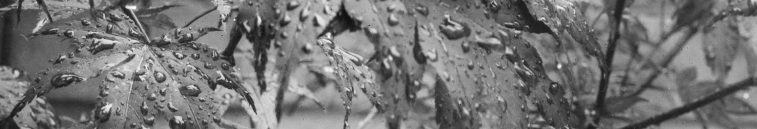
It went straight to lith processing, using the same batch of EasyLith diluted A:20ml+B:20ml+Water:1000ml at 30°C as the first print. Although this paper is Grade 2, many have said it is quite contrasty. I was using a condenser enlarger, no filters, and the negative had been processed in Pyrocat, so was fairly low contrast with a quite marked stain from the dev. The film was Tri-X and the format 6x9cm, from my Fuji GW690III.
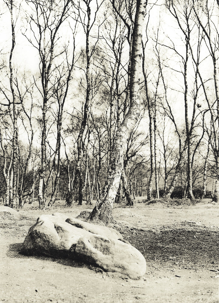
The first print looked too light, and was also very contrasty. It didn’t have a lot of colour either, but once dried it turned out to be acceptable and is shown at the top of the page. What is worth noting is that in the wash it appeared that the highlights lacked any detail, but the ‘dry down’ resulted in them showing sufficient to make this a ‘keeper’.
For the second print I increased the exposure by 1 stop and also burned in the top tree line by a further 1 stop. This was too much on both counts and the print developed far too quickly, with the overal tonality quite heavy and dark.
So I used this print for the two-pass lith process, bleaching the image completely (after fixing and washing) using copper bleach, then further washing followed by redevelopment in the same batch of EasyLith as above.
The print is still a bit too dark, but the two-pass method did result in more colour and the shading helped bring out the subtle misty trees behind the foreground ones. There is a split-toned ‘patchiness’ about it, which makes this seem a process worthy of further exploration with this paper, with more careful exposure and processing – and perhaps a more suitable negative.
Finally, while examining the print scans in Adobe Lightroom at full size, I noticed that both prints exhibited ‘pepper fog’, also known as the ‘peppercorn’ effect. This is first time I have seen this in my limited experience of lith printing and it isn’t really visible in the actual prints at normal viewing distance. It is definitely there on both prints though, as this side by side comparison shows:
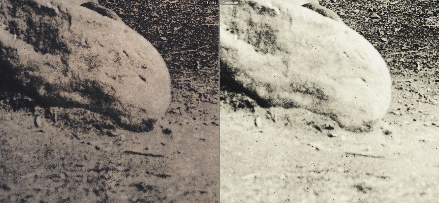
Side by side comparison of Unibrom lith prints showing pepper fog.
I viewed the scans of the first print at the same magnification and found some evidence of it in the sky tone on these as well, but nowhere near as prevalent and certainly not noticeable at normal viewing size.
Undoubtedly its increase resulted from the developer being quite old by the time these second prints were done, with longer processing times occurring as well. The solution will be to try adding some 10% sodium sulfite to the developer, although in the example here I do not feel that the peppercorn effect has had too detrimental effect on the overall appearance of the final image. In Tim Rudman‘s words, you have a choice with pepper fog, ‘either use it or lose it’. In this particular case I’ll choose to just use it.
Hello,
I am wondering if you have any further experience with the differences between grades 2, 3, and 4 of Slavich Unibrom in Lith? I am looking into buying this paper, but am unsure which grade to buy. I have heard that the different grades exhibit different effects in their texture / Lith effect. Do you have any insights into this? Thank you!
Hi Eli, Apologies for late response, haven’t visited for a while!
My experience with differing grades is limited, I only have 2 and 3. So far I have found that both exhibit similar properties, although the tendency to pepper fog seems more prevalent on the Grade 3. However, the many variables in lith processing may affect this. As a starting point I would suggest getting some Grade 2 and 3 and experiment under your own processing regime.
Pingback:Slavich Unibrom in Easylith | Real Photographs